Hello, allow me to dust off the blog a bit.
There are some great interviews with Jillian Tamaki on her blog and website (under FAQ) recently, my favourite one consists of questions given to her by her students (the lucky dogs). There's also some great imput from John Hendrix.
Excerpt:
If I have many different styles, how should I promote them?
This is a question I hear often. I suppose it’s because my own portfolio contains a variety of “styles”. I should say that putting together a portfolio is more of an art than a science. My thought is, however, that your portfolio should be more consistent when you are a starting illustrator. But consistency can be more nuanced than “all 12 portfolio pieces should be identical”… consistency across a body of work can be more about a consistent tone, flavour, or conceptual style. Not just aesthetics. But back to the question: I think you should tailor your promotional materials, sending images that are most appropriate for the potential client. But at the same time being open-minded about what is and isn’t appropriate. For example, the NYT Op-Ed runs dioramas, children’s book-style art, photo-illustration, etc. Not just black and white, metaphor-heavy line-art. You can only gauge your portfolio’s effectiveness after probably 6 months of earnest promotion.
Wednesday, March 21, 2012

Thursday, December 15, 2011
Resources: Vector Tutorials
Hi guys,
Here are some neato vector tutorials:
Figure Shading: when less is more, by Russel Tate. Ever wonder how people use gradients to shade vector illustrations? Because I totally have. A nice explanation by Russel Tate try to ignore the fact it's associated with istock.
From sketch to vector illustration by William Beachy is about Beach's process from sketch to vector illustration. What I think is most useful here is how he uses traditional comic inking "rules" to draw digitally.
Quick Tip: How to Cell Shade and add Texture to a Vector Comic Character is just like the man says.

Here are some neato vector tutorials:
Figure Shading: when less is more, by Russel Tate. Ever wonder how people use gradients to shade vector illustrations? Because I totally have. A nice explanation by Russel Tate try to ignore the fact it's associated with istock.
From sketch to vector illustration by William Beachy is about Beach's process from sketch to vector illustration. What I think is most useful here is how he uses traditional comic inking "rules" to draw digitally.
Quick Tip: How to Cell Shade and add Texture to a Vector Comic Character is just like the man says.
Tuesday, November 29, 2011
Resources: free figure reference
Hi guys,
Here's a really, really amazing resource: CharacterDesign.com has free, high quality figure reference (obviously NSFW).
Here is a sample of their new zombie vs. schoolgirls set:

Here's a really, really amazing resource: CharacterDesign.com has free, high quality figure reference (obviously NSFW).
Here is a sample of their new zombie vs. schoolgirls set:
Tuesday, November 8, 2011
Resources: Kathryn Adams Top Promo FAQs
Promo refresher, Q and A from illustrator and super-teacher Kathryn Adams at over at Nook's blog: Kathryn Adams Top Promo FAQs

Wednesday, November 2, 2011
Resources: Nook Collective
I recently went to a lecture at Nook Collective at 156 Augusta. The lecture was by a really great illustrator and all-around-guy named Leif Peng who runs the blog Today's Inspiration.
The Nook is a really neat group studio that is also holds workshops on mysterious things like Final Cut Pro and self promotion (by Kathryn Addams!). Some workshops are free, some are modestly priced, all are worth checking out! Find their schedule at their website Nook Collective
The Nook is a really neat group studio that is also holds workshops on mysterious things like Final Cut Pro and self promotion (by Kathryn Addams!). Some workshops are free, some are modestly priced, all are worth checking out! Find their schedule at their website Nook Collective

Friday, October 21, 2011
Resources: (free?) 3D figure reference software
Read about it at Laser Biscuit. Download here. So check it out and let us know what you think!
Also, the public library has figure reference books that come with CDs - you can transfer these CD images to your hardrive. Search keywords "figure reference" and get the books transferred to your local branch. I'm just sayin'.
Also, the public library has figure reference books that come with CDs - you can transfer these CD images to your hardrive. Search keywords "figure reference" and get the books transferred to your local branch. I'm just sayin'.
Tuesday, September 27, 2011
Newest boards!

I will be a mother fucking storyboard artist. Even if it kills my neck!
Lot of changes in this one; departing from the Kuzma style of drawing to a more rapid sketch line, much bolder guache style colouring. And an original commercial by me! The idea was a single camera moving along the bell logo. "Where ever you are, however you are, Bell is with you with new blah blah 4G service."
Crits are more than welcome! Where can I improve?
Wednesday, September 21, 2011
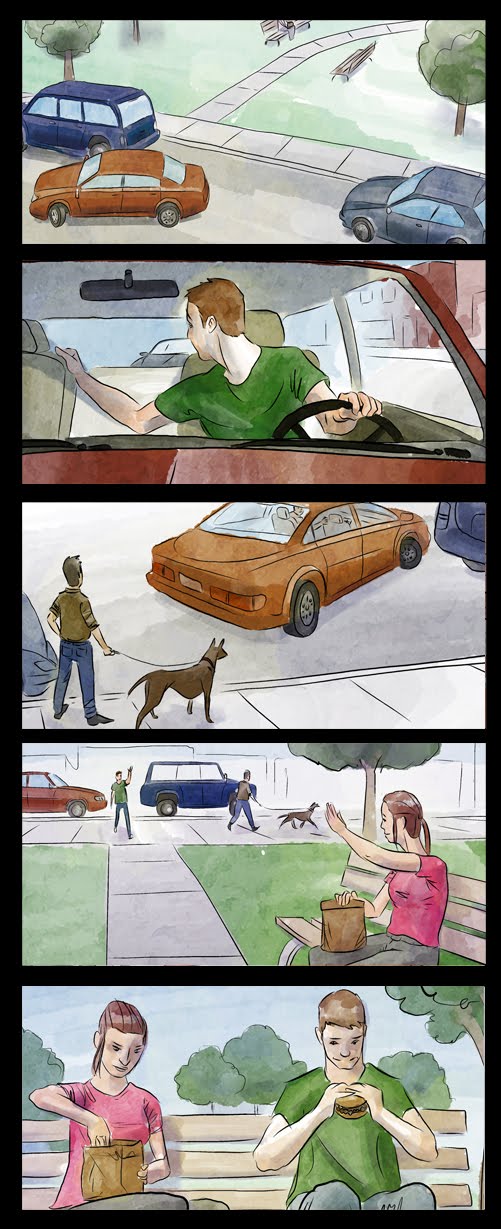
New Storyboards!
Hey! It's been awhile but I am still alive and working away at those storyboards. Here's the latest batch, the next set will look quite different as I experiment with a less watercolouree way of colouring.
Friday, September 16, 2011
Resources: Computer Arts Self Promotion Issue
Hey Critters,
The latest issue of Computer Arts is all about self promotion.
As always, useful stuff on their Tutorials page.
The latest issue of Computer Arts is all about self promotion.
As always, useful stuff on their Tutorials page.
Friday, September 9, 2011
Resources: Blogs and Websites
Hi guys!
This post is about some cool blogs and websites you might want to check out:
Today's Inspiration, illustration from the 40s and 50s lovingly managed by Leifpeng who is also a great illustrator in his own right.
Animation Archive, a digital archive (and actual physical museum/library) devoted to animation and illustration art. You don't have to be a member to browse a huge selection of digitally archived art. They also have a podcast.
Gurney Journey, a blog by James Gurney (creator of Dinotopia, hellz yeah!). If you're into it, he has a few books out on realistic fantasy painting and lots of neat painting and drawing advice on his blog. Also a really accomplished fine artist.
Alexis
This post is about some cool blogs and websites you might want to check out:
Today's Inspiration, illustration from the 40s and 50s lovingly managed by Leifpeng who is also a great illustrator in his own right.
Animation Archive, a digital archive (and actual physical museum/library) devoted to animation and illustration art. You don't have to be a member to browse a huge selection of digitally archived art. They also have a podcast.
Gurney Journey, a blog by James Gurney (creator of Dinotopia, hellz yeah!). If you're into it, he has a few books out on realistic fantasy painting and lots of neat painting and drawing advice on his blog. Also a really accomplished fine artist.
Alexis
Thursday, September 8, 2011
Resources: Organizing Background Layout Elements
Hey guys!
John K. is an amazing animator (Ren and Stimpy, you guuyyss!) and he posts all sorts of interesting observations and advice on his blog. I came across a really great post about the ins and outs of layout organization which I thought some of you might find useful. See the post here.
Another one about positive/negative space can be found here.
Alexis
John K. is an amazing animator (Ren and Stimpy, you guuyyss!) and he posts all sorts of interesting observations and advice on his blog. I came across a really great post about the ins and outs of layout organization which I thought some of you might find useful. See the post here.
Another one about positive/negative space can be found here.
Alexis
Tuesday, August 30, 2011


Monday, August 15, 2011
FanExpo!

Here's a sketch for FanExpo. Basically, it is a line drawing later filled in area by area and I'd love to get some crits on this piece cuz I'm sure I got lazy in areas!
Also, a sneak peek.

August a busy month for anyone else?
Fanexpo, job(coffeeshop), finding contacts, beach, oh, I'm storyboarding for a music video/cooking show in space! The puppets look like they are going to be great. :)
Tuesday, August 2, 2011
Hey! Now I'm gonna try this thing!
I'm in the middle of this painting. I was really feeling it for a while, but then somewhere along the way I started to dislike it. Maybe it's just at that awkward, half-finished stage, but if you have any helpful advice I'd be grateful.
This girl is a witch, and she's casting a spell to keep away those mosquitoes. The bugs are just blocked in colour right now - more detail to come. I'm also planning to clean up some of the lines and shapes, and touch up my gouache where the paint is a little thin.
Do you think I should integrate the colours more throughout the painting, or does the strong yellow/blue separation work?

I'm in the middle of this painting. I was really feeling it for a while, but then somewhere along the way I started to dislike it. Maybe it's just at that awkward, half-finished stage, but if you have any helpful advice I'd be grateful.
This girl is a witch, and she's casting a spell to keep away those mosquitoes. The bugs are just blocked in colour right now - more detail to come. I'm also planning to clean up some of the lines and shapes, and touch up my gouache where the paint is a little thin.
Do you think I should integrate the colours more throughout the painting, or does the strong yellow/blue separation work?

Resources: Comic Inkers Blog
Here's something cool, a blog by a group of professional comic inkers: Inkers.org. It looks to be pretty dead but there are a handful of great posts to look at, including step-by-step inking and a couple of time lapse video.
To Tree or Not to Tree
I'm working on this drawing, I want to add something to the drawing to give the picture more movement, I was thinking some kind of tree + leaves combo but I'm having trouble fitting them in there.
I feel like they're at the their minimum in terms of size/croppage, If I start making them any smaller or further away they'll start being unrecognizable.
Maybe the solution is just to rearrange a few branches? Or is it okay that the branches/wheels touch?
With trees:

Without trees:

The dimensions are fixed so I can't widen or lengthen.
Ideas? Feel free to draw over it. Other suggestions also welcome.
I feel like they're at the their minimum in terms of size/croppage, If I start making them any smaller or further away they'll start being unrecognizable.
Maybe the solution is just to rearrange a few branches? Or is it okay that the branches/wheels touch?
With trees:
Without trees:
The dimensions are fixed so I can't widen or lengthen.
Ideas? Feel free to draw over it. Other suggestions also welcome.
Tuesday, July 19, 2011


Saturday, July 16, 2011
Trifromage

2. Brought up contrast a lil with an adjustment layer
and moved the green fill layer to below the colours.
Hard to tell if it's now too dark in the figures!

1. Been working on this for FanExpo in August. 95%! Need
help with the last 5.
crits / suggestions / opinions ?
Sunday, July 10, 2011
Hey Critters,
Check out Escape from Illustration Island, a resource/inspiration page run by the illustrators we both fear and love. But seriously, there's a podcast, I mean how cool is that! Also there's some really great practical advice on there about developing mailing lists and other things along that vein.
Squishy love,
Alexis
Check out Escape from Illustration Island, a resource/inspiration page run by the illustrators we both fear and love. But seriously, there's a podcast, I mean how cool is that! Also there's some really great practical advice on there about developing mailing lists and other things along that vein.
Squishy love,
Alexis
Subscribe to:
Posts (Atom)