Hey Critters,
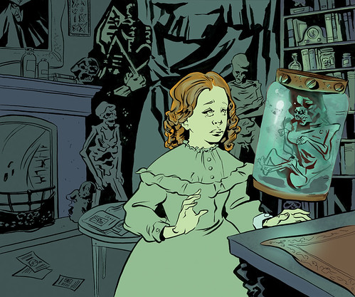
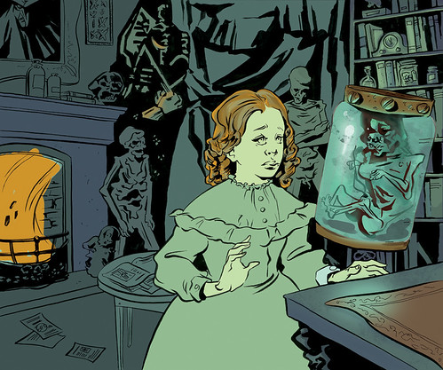
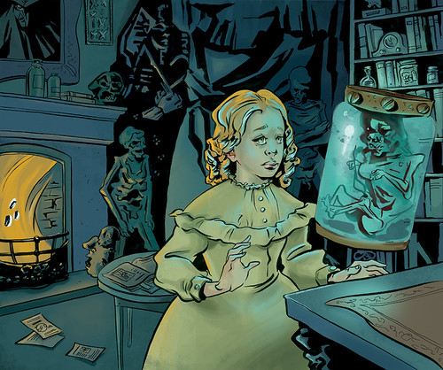
This is where I am right now, I've kept the palette minimal per your awesome suggestions and have tried to make the main character the focal point by giving her both orange and blue reflective lighting. I've also tried to balance the flat(ter) areas with more painterly areas. I think I'm getting a little better at knowing where to put texture.
CLICK FOR BIG
Thoughts?? Does anything stand out as weird? Go nuts, guys!
Thursday, June 30, 2011
Tuesday, June 28, 2011
Storyboard: Updated July 3rd, 2011
I redrew some of the characters' facial expressions and tried to get more depth by erasing out the background blues in areas. Counting this one as done and on to the next!
I did this set of storyboards using a Rogers commercial for reference and would like your feedback on it! I want to know what panels work, and what ones don't. Thankee!
Monday, June 27, 2011
Hey Critters (look - I made a funny!),
You may already know this but Andrew Loomis' books are available online. Get 'em while they're hot because Loomis books are currently being reprinted and the links will probably start going down.
Handy Tip: you can get a book coil bound at fedex for like $6.00.
Alexis
You may already know this but Andrew Loomis' books are available online. Get 'em while they're hot because Loomis books are currently being reprinted and the links will probably start going down.
Handy Tip: you can get a book coil bound at fedex for like $6.00.
Alexis
Tuesday, June 21, 2011
Hey guys,
Let me start the ball rolling with something I've been working on that is causing me trouble - the colour of this piece.
I like the colour but I'm not sure if I should keep it this simple (i.e keep the palette minimal and shade the rest of the piece like I did the bookcase) or try to make the objects in the room their 'correct' colours.
I was thinking of making the fire orange so there would be a blue light source and an orange light source. Should I make it blue instead?? Is it too distracting?
Click images for larger versions.
What do you guys think??
Monday, June 20, 2011
Bring the Crit: a group crit blog
Hey guys!
Have you been missing in-class critiques? Find yourself working alone in your studio with no one but your cat to ask for advice?
Well fret no more!
This is a group crit blog for OCAD students (pre, post and current): post your illustrations, life drawings, sketches, personal projects and receive some friendly, constructive criticism. Free of charge, no appointment necessary, walk-ins welcome!
PLEASE NOTE: to enable you to post I have to add you as an author which means I need your email address - please email your addy to alexis.barattin@gmail.com and I'll add you in!
Cheers!
Alexis
Subscribe to:
Posts (Atom)