Let me start the ball rolling with something I've been working on that is causing me trouble - the colour of this piece.
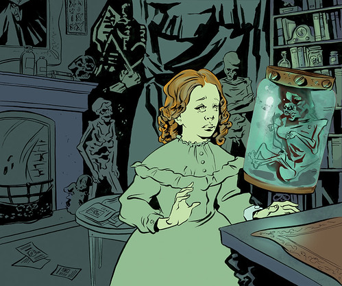
I like the colour but I'm not sure if I should keep it this simple (i.e keep the palette minimal and shade the rest of the piece like I did the bookcase) or try to make the objects in the room their 'correct' colours.
I was thinking of making the fire orange so there would be a blue light source and an orange light source. Should I make it blue instead?? Is it too distracting?
Click images for larger versions.
What do you guys think??
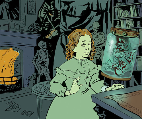
I think the piece might be a litttttle flat without the added lightsource - I didn't know there was fire in the fireplace in the first piece. Although, that being said, I feel the orange of the fire is a little heavy; my eye draws immidiately to that. The piece has alot of depth with both cool and warm tones in the second piece, but if there's a way you might be able to add a slight transparent cool layer over the edges/corners/fire afterward, that might be it? Perhaps even make the fire a colour aside from orange? (Detail and all. Like a light blue flame?)
ReplyDeleteThis crit is a little all over the place, apologies. Looking fantastic though, Alexis!
I think you should keep the palette pretty minimal, but bringing some subtle red and orange to select areas is a good idea. It adds a lot to the piece I think! But keep it restricted, and try to make the fire a little less over-powering - I agree that it draws the eye a bit too much.
ReplyDeleteUgh it's so nice. SO NICE.
I think that fire would allow you to really turn the girl into the focus of the image by having only her shaded with the two light sources. Also, I feel like the thick black masses in the bg could merged better with the areas of thin, descriptive lines.
ReplyDeleteWhy the crap isn't it possible to reply directly to someone's post...
ReplyDeleteAnyway!
Ka:
I think you're right, I'd have to give the fire a bit of.. painterlyness so it doesn't look like one big flat thingie... I'm hoping that when I start to add in some reflective light (especially on the girl's figure, the colour won't be so isolated? What's going on with the bookcase on the right is kind of what I had in mind as far as how intense i'd want to take the painting and after reading your comment and looking it again I agree that it shouldn't be left totally flat as it is. I did consider making both the pickled punk jar AND the flame turquoise but thought this might be a good chance to mix complementaries? Thank youuu!!
Kaley:
Thanks! and I think you're right re: palette. I AM SO SCURRED OF THE MINIMAL. Not sure if the reflected light will bury the orange a bit? But I'll have to keep that in mind as I go so it doesn't become the unintended focal point.
Animatian:
I think that fire would allow you to really turn the girl into the focus of the image by having only her shaded with the two light sources. I'm going to pretend that was my idea the whole time! Thank you. And yeah, I was looking at the black in the background and wondering if it all wasn't too... heavy looking. I was thinking I would open-space-light-linework of the girl off of the thick background but maybe I should try eliminating some of the harder edges so it's not so... imposing?