Thursday, December 15, 2011

Resources: Vector Tutorials

Hi guys,

Here are some neato vector tutorials:

Figure Shading: when less is more, by Russel Tate. Ever wonder how people use gradients to shade vector illustrations? Because I totally have. A nice explanation by Russel Tate try to ignore the fact it's associated with istock.

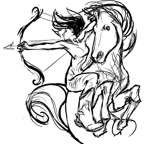
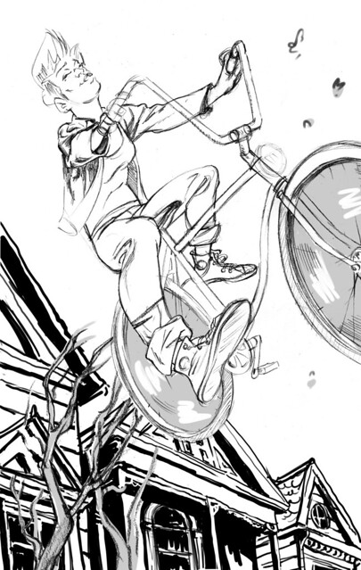
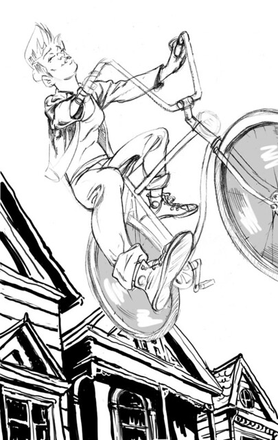
From sketch to vector illustration by William Beachy is about Beach's process from sketch to vector illustration. What I think is most useful here is how he uses traditional comic inking "rules" to draw digitally.

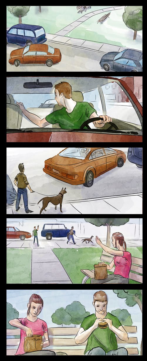
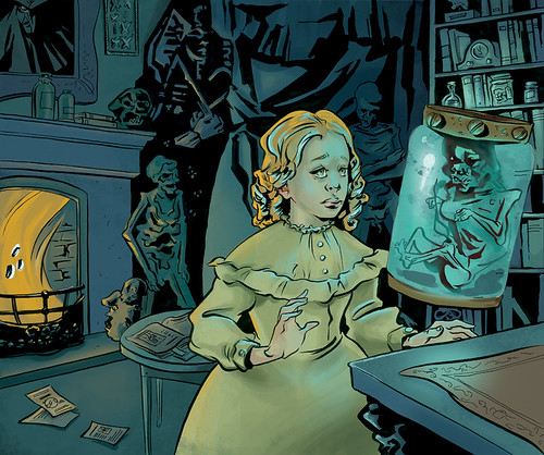
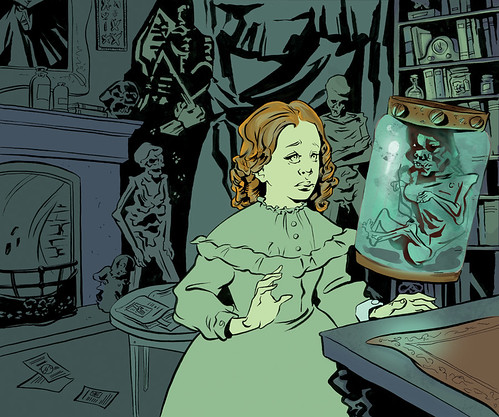
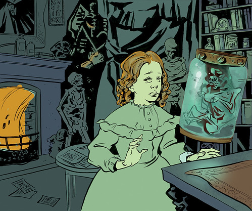
Quick Tip: How to Cell Shade and add Texture to a Vector Comic Character is just like the man says.

the-more-you-know

Tuesday, November 29, 2011

Resources: free figure reference

Hi guys,

Here's a really, really amazing resource: CharacterDesign.com has free, high quality figure reference (obviously NSFW).

Here is a sample of their new zombie vs. schoolgirls set:

Photoset_040_2222 (1)

the-more-you-know

Tuesday, November 8, 2011

Wednesday, November 2, 2011

Resources: Nook Collective

I recently went to a lecture at Nook Collective at 156 Augusta. The lecture was by a really great illustrator and all-around-guy named Leif Peng who runs the blog Today's Inspiration.

The Nook is a really neat group studio that is also holds workshops on mysterious things like Final Cut Pro and self promotion (by Kathryn Addams!). Some workshops are free, some are modestly priced, all are worth checking out! Find their schedule at their website Nook Collective

the-more-you-know
Here's a sketch for your concritteration (I'm hilarious!), I'm getting stuck on dem legs. I think they're nice legs, but to me they're feeling a little lifeless. Suggestions, reference material, gifts of monetary value, all welcome:

Archer sketch

Friday, October 21, 2011

Resources: (free?) 3D figure reference software

Read about it at Laser Biscuit. Download here. So check it out and let us know what you think!

Also, the public library has figure reference books that come with CDs - you can transfer these CD images to your hardrive. Search keywords "figure reference" and get the books transferred to your local branch. I'm just sayin'.

the-more-you-know

Tuesday, September 27, 2011

Newest boards!


I will be a mother fucking storyboard artist. Even if it kills my neck!
Lot of changes in this one; departing from the Kuzma style of drawing to a more rapid sketch line, much bolder guache style colouring. And an original commercial by me! The idea was a single camera moving along the bell logo. "Where ever you are, however you are, Bell is with you with new blah blah 4G service."
Crits are more than welcome! Where can I improve?

Wednesday, September 21, 2011

New Storyboards!

Hey! It's been awhile but I am still alive and working away at those storyboards. Here's the latest batch, the next set will look quite different as I experiment with a less watercolouree way of colouring.

Friday, September 9, 2011

Resources: Blogs and Websites

Hi guys!

This post is about some cool blogs and websites you might want to check out:

Today's Inspiration, illustration from the 40s and 50s lovingly managed by Leifpeng who is also a great illustrator in his own right.

Animation Archive, a digital archive (and actual physical museum/library) devoted to animation and illustration art. You don't have to be a member to browse a huge selection of digitally archived art. They also have a podcast.

Gurney Journey, a blog by James Gurney (creator of Dinotopia, hellz yeah!). If you're into it, he has a few books out on realistic fantasy painting and lots of neat painting and drawing advice on his blog. Also a really accomplished fine artist.

Alexis

the-more-you-know

Thursday, September 8, 2011

Resources: Organizing Background Layout Elements

Hey guys!

John K. is an amazing animator (Ren and Stimpy, you guuyyss!) and he posts all sorts of interesting observations and advice on his blog. I came across a really great post about the ins and outs of layout organization which I thought some of you might find useful. See the post here.

Another one about positive/negative space can be found here.

Alexis

the-more-you-know

Tuesday, August 30, 2011

Hi Guys,

Another A or B question - which one and why?

A.

bike-web-wtrees

B.
bike-web-withouttrees

This piece is about trying to capture the feeling of that last summer bike ride.

Monday, August 15, 2011

FanExpo!


Here's a sketch for FanExpo. Basically, it is a line drawing later filled in area by area and I'd love to get some crits on this piece cuz I'm sure I got lazy in areas!

Also, a sneak peek.


August a busy month for anyone else?

Fanexpo, job(coffeeshop), finding contacts, beach, oh, I'm storyboarding for a music video/cooking show in space! The puppets look like they are going to be great. :)

Tuesday, August 2, 2011

Hey! Now I'm gonna try this thing!

I'm in the middle of this painting. I was really feeling it for a while, but then somewhere along the way I started to dislike it. Maybe it's just at that awkward, half-finished stage, but if you have any helpful advice I'd be grateful.

This girl is a witch, and she's casting a spell to keep away those mosquitoes. The bugs are just blocked in colour right now - more detail to come. I'm also planning to clean up some of the lines and shapes, and touch up my gouache where the paint is a little thin.

Do you think I should integrate the colours more throughout the painting, or does the strong yellow/blue separation work?

Resources: Comic Inkers Blog

Here's something cool, a blog by a group of professional comic inkers: Inkers.org. It looks to be pretty dead but there are a handful of great posts to look at, including step-by-step inking and a couple of time lapse video.


the-more-you-know

To Tree or Not to Tree

I'm working on this drawing, I want to add something to the drawing to give the picture more movement, I was thinking some kind of tree + leaves combo but I'm having trouble fitting them in there.

I feel like they're at the their minimum in terms of size/croppage, If I start making them any smaller or further away they'll start being unrecognizable.

Maybe the solution is just to rearrange a few branches? Or is it okay that the branches/wheels touch?

With trees:

bike-web-wtrees

Without trees:

bike-web-withouttrees

The dimensions are fixed so I can't widen or lengthen.

Ideas? Feel free to draw over it. Other suggestions also welcome.

Tuesday, July 19, 2011


Good morning fellow critters.
Just finished this dealy.
Any thoughts? It's supposed to play off this image...
http://rewfoe.grandportfolio.com/#n12909
There will be 3 in the end, one for each character.

and a bit of process work too.

I'm trying to make him pop from the background, is it successful?

Saturday, July 16, 2011

Trifromage

2. Brought up contrast a lil with an adjustment layer
and moved the green fill layer to below the colours.
Hard to tell if it's now too dark in the figures!


1. Been working on this for FanExpo in August. 95%! Need
help with the last 5.

crits / suggestions / opinions ?


Sunday, July 10, 2011

Hey Critters,

Check out Escape from Illustration Island, a resource/inspiration page run by the illustrators we both fear and love. But seriously, there's a podcast, I mean how cool is that! Also there's some really great practical advice on there about developing mailing lists and other things along that vein.

Squishy love,

Alexis

Friday, July 8, 2011

Process work


A bit about the process, on the left there, I started with a pencil sketch then put color underneath it in photoshop, brought it to illustrator and did the tedious task of copying every single line carefully with the pen tool. Make sure you keep your layers in awesome order or you die a terrible, terrible death, it begins with your eyes falling out, I won't get into it.

Then I again, tediously, select each individual object and use the eye dropper tool on the color behind it to make sure that it is the right color, a process I like to call FLIPPING the image. Because you're flipping it from line to color. and then when it's all filled out I brought it to photoshop and applied textures! I also uploaded a different version of the final with colors I like a bit better.

See ya soon!

Rewfoe

**edit, I put up a new version... hopefully that works a bit better.

Thursday, July 7, 2011

Streets of Dungaree


Hi folks, doing more for Tin Canyon, trying to create more artwork for the show on August 12th, please come!

I'm having some trouble with textures, and colors I think... something seems off. Suggestions?

Oh yeah, one more thing.

I LOVE YOU <3.

Rewfoe

Monday, July 4, 2011

New Boards!

Pull out your Berger hats, I'd love to hear what you think of these panels.


Thursday, June 30, 2011

Hey Critters,

This is where I am right now, I've kept the palette minimal per your awesome suggestions and have tried to make the main character the focal point by giving her both orange and blue reflective lighting. I've also tried to balance the flat(ter) areas with more painterly areas. I think I'm getting a little better at knowing where to put texture.

victorian-web-flat-FINAL-blueversion

CLICK FOR BIG

Thoughts?? Does anything stand out as weird? Go nuts, guys!

Tuesday, June 28, 2011

Storyboard: Updated July 3rd, 2011

I redrew some of the characters' facial expressions and tried to get more depth by erasing out the background blues in areas. Counting this one as done and on to the next!


I did this set of storyboards using a Rogers commercial for reference and would like your feedback on it! I want to know what panels work, and what ones don't. Thankee!


Monday, June 27, 2011

Hey Critters (look - I made a funny!),

You may already know this but Andrew Loomis' books are available online. Get 'em while they're hot because Loomis books are currently being reprinted and the links will probably start going down.

Handy Tip: you can get a book coil bound at fedex for like $6.00.

Alexis

Tuesday, June 21, 2011

Hey guys,

Let me start the ball rolling with something I've been working on that is causing me trouble - the colour of this piece.

victorian-web-WIP

I like the colour but I'm not sure if I should keep it this simple (i.e keep the palette minimal and shade the rest of the piece like I did the bookcase) or try to make the objects in the room their 'correct' colours.

I was thinking of making the fire orange so there would be a blue light source and an orange light source. Should I make it blue instead?? Is it too distracting?

victorian-web-test2

Click images for larger versions.

What do you guys think??

Monday, June 20, 2011

Bring the Crit: a group crit blog

Hey guys!

Have you been missing in-class critiques? Find yourself working alone in your studio with no one but your cat to ask for advice?

Well fret no more!

This is a group crit blog for OCAD students (pre, post and current): post your illustrations, life drawings, sketches, personal projects and receive some friendly, constructive criticism. Free of charge, no appointment necessary, walk-ins welcome!

PLEASE NOTE: to enable you to post I have to add you as an author which means I need your email address - please email your addy to alexis.barattin@gmail.com and I'll add you in!

Tekenles op Amsterdamse school / Drawing lesson

Cheers!

Alexis