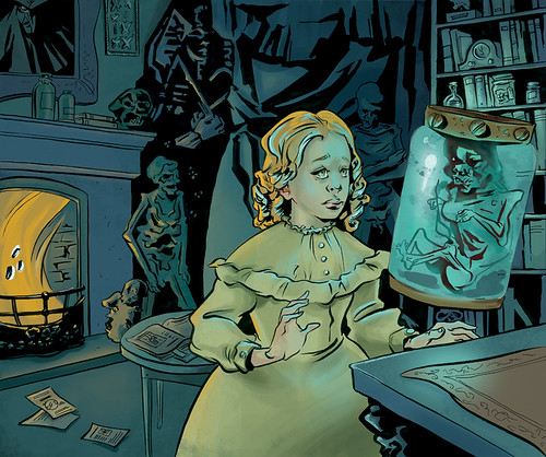
This is where I am right now, I've kept the palette minimal per your awesome suggestions and have tried to make the main character the focal point by giving her both orange and blue reflective lighting. I've also tried to balance the flat(ter) areas with more painterly areas. I think I'm getting a little better at knowing where to put texture.
CLICK FOR BIG
Thoughts?? Does anything stand out as weird? Go nuts, guys!
The fire still stands out as odd to me! It could be darker or just more broken up so that the glow is the brightest light. And def get rid of the black/white circles as i believe they give too much contrast to that area; the fire isnt that important.
ReplyDeleteThe background looks great to me otherwise. As does the girl, good work Alexis!
I think you're right - the fireplace is too eyecatching right now. I think I will get rid of the white/black.. "the fire isn't that important" - good point!
ReplyDeleteTake a look at her face again, I think there are a few things that could be done with it...the lower eyelids for one seem too low. The (our)left eye could be moved to the left a bit. the black shape underneath her armpit seems odd to me as well.
ReplyDeleteSorry if this seems nitpicky :s
I think it looks terrific!
ReplyDeleteThe reason I have been slow with my critique is that I can't really think of anything that bothers me besides things that have already been mentioned - the fire, and the coals in it, being a bit too eyecatching. Aside from that everything looks rad. I actually like the stylization of the face (looks more like Mina!)
I keep noticing cool things about it! I love the creepy portrait up in the corner.